Everyday Lean-Visual Data Charting
A few months ago, my wife ran into an acquaintance who had her 3 year-old grandson in tow. Gretchen greeted the boy and asked him his name. He spoke softly and Gretchen didn't understand. He repeated it, she still missed it. He tried again and Gretchen just couldn't understand. Grandma filled in the missing information, but this event, along with some other observations, led Gretchen to have her hearing tested.
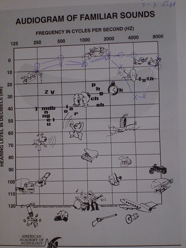
Her appointment was a few weeks ago and the result of the test was the chart I show above. This chart is a wonderful example of a visual tool for data. Two things jump out at me.
First, the obvious and necessary information is there. From left to right across the top is the frequencies of human hearing. Going down the left side is the magnitude of the sound, in decibels (dB) from soft to loud. The audiologist plotted Gretchen's hearing in both ears and drew these data, by hand, along the top, as you can see.
The second thing, though, is the additional data on the chart. Note that certain familiar sounds are on the chart. Their position shows their frequency and relative loudness. Also included are certain vowel and consonant sounds.
And it is this where this chart is so outstanding. Take a look near the intersection of 4 kHz and 20 dB. The chart shows the letters f, s, and th as being typically at that loudness and frequency. And further, you can see that Gretchen's left ear showed a deficiency at this frequency.
When Gretchen got this chart and thought back to the incident with the child, she had a great sense of relief.
You see, the little boy's name was Seth.
By adding diagnostic information on this chart, the audiologist enabled the patient to understand typical reactions. It allows the patient to see how she hears. In Gretchen's case, she feared a major hearing loss. What she saw was a localized loss at 4 kHz. Had the boy's name been Bill or Jim, she would have probably understood him perfectly. The name "Seth," however, remained a challenge.
Statistical control charts are a hugely useful and key part of most lean systems. Consider, though, ways to make it more than just cold data. Build in visual tools that helps the user make her own diagnosis and correction.
Put another way, this blog shows the linguistic difference between assertions and assessments, but that discussion is for another day.
I hope this is helpful. And, if your name is Seth and you ever get a chance to meet my wife, please be sure to speak up.


